Agency · Brand · Web

Innovatrix Teams Live

Innovatrix Teams LTD is a technology and digital solutions company specializing in UI/UX design, software development, branding, and digital transformation services for startups and businesses.

Let's Connect
Role
UI/UX Designer
Timeline
5 days
Tools
Figma, ChatGPT
Platform
Web · Desktop & Mobile

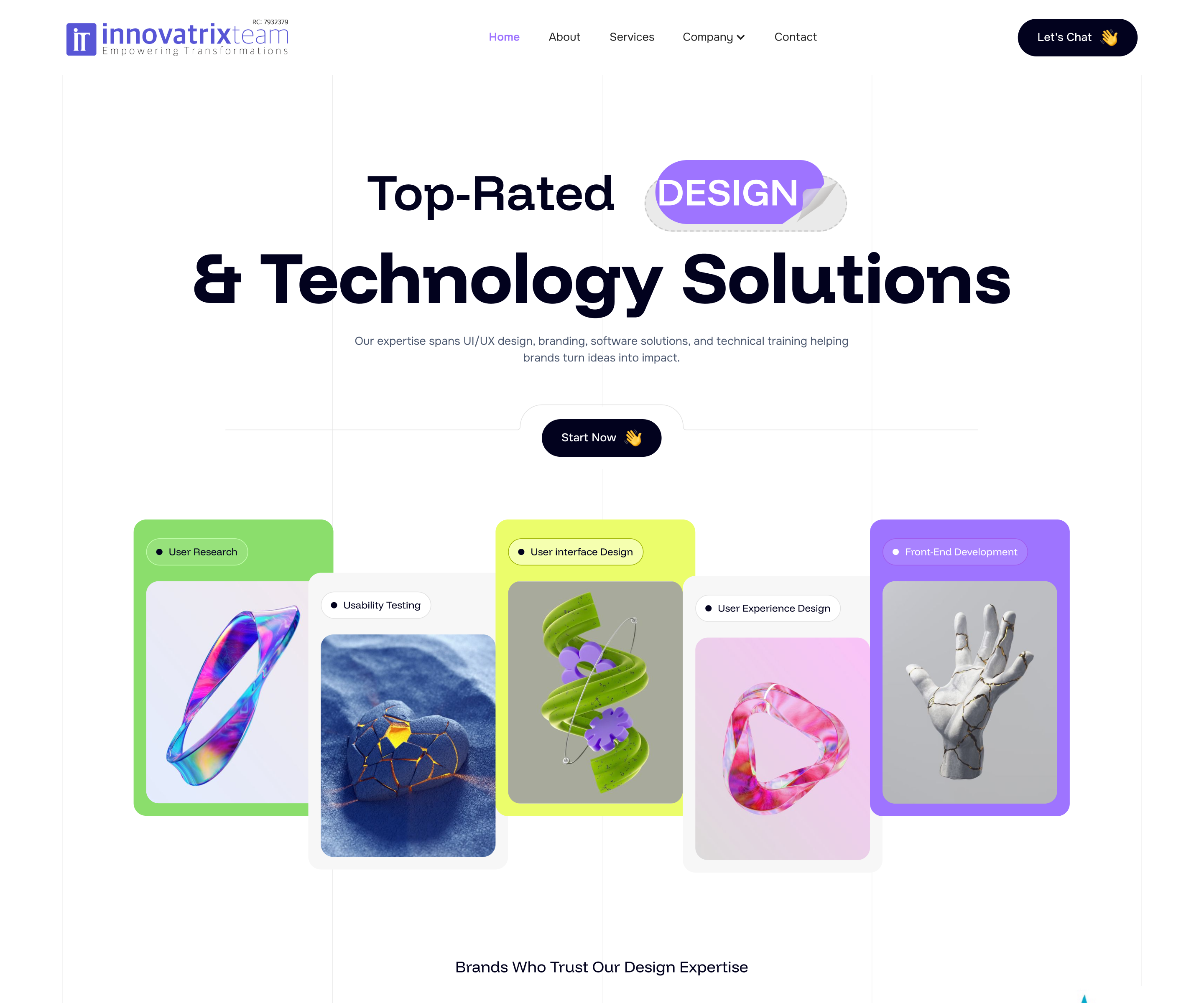
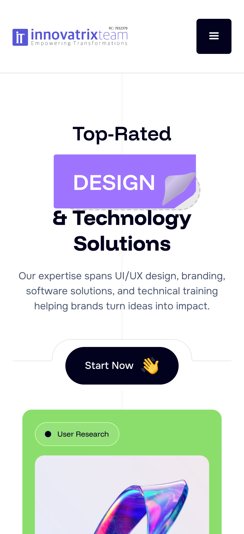
Desktop and mobile, side by side

The same conversion story, adapted for each viewport - proof and CTA first on both.

Desktop
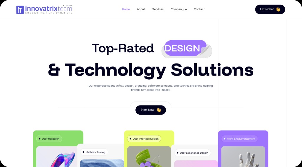
Innovatrix Teams desktop home hero design
Mobile
Innovatrix Teams mobile home hero design

Building a digital front door for a design-led agency

Innovatrix Teams LTD had strong delivery and referral momentum, but no owned website to convert cold interest. The brief was a greenfield multi-page experience that could sell UI/UX, software development, branding, and digital transformation without reading like another agency template.

I led end-to-end UI/UX: stakeholder interviews, survey synthesis, information architecture, lo-fi structure, visual system, hi-fi UI, and pre-launch validation. The goal was simple to state and hard to execute - earn trust in the first scroll, make services scannable, and turn curiosity into a conversation.

From no website to a conversion-ready presence

Problem

No owned site to convert interest

Leads came through referrals, WhatsApp, and social DMs. That worked for warm intros, but cold prospects had nowhere credible to evaluate services, team, or how to start.

  • No Home to Services to Contact funnel
  • Hard to prove design + build fit in one place
  • Brand looked smaller than the work on social alone
Approach

Research first, then structure, then polish

I treated the site like a product funnel: talk to decision-makers, map jobs-to-be-done, design for skim-then-depth, and test the risky bits before locking hi-fi.

  • Survey + interviews shaped hero and Services IA
  • Three primary jobs: hire, understand culture, contact
  • Proof and CTA above the fold; depth after trust

Solution

A live, conversion-first multi-page site

One shared nav, footer, and visual system across Home, About, Services, Company, and Contact. Home leads with proof and CTA, Services scans with clear hierarchy, About carries culture and careers, and Contact stays low-friction.

Six phases, two validation gates, one shipped system

Research and structure had to move fast without skipping the moments that prevent rework. Wireframes and hi-fi each got a dedicated check-in before moving forward.

Gate A

After structure

Sitemap and wireframes reviewed for IA clarity before visual exploration.

Gate B

After hi-fi

Usability tests on hero comprehension, Services hierarchy, and Contact completion.

Sitemap

Primary nav stays flat. Portfolio and Blog sit under Company, matching how prospects browse work and stories without cluttering the top bar.

Three people the site must work for

Adaobi Okonkwo

Adaobi Okonkwo

Founder · 28

"I need a partner who gets product, not just pretty screens."

Goals

  • Find a credible UI/UX + build partner fast
  • See proof they've shipped similar work
  • Start a scoped conversation without sales fluff

Frustrations

  • Agency sites that bury services
  • No clear pricing signal or process
  • Forms that ask for everything upfront
Tunde Balogun

Tunde Balogun

Marketing lead · 34

"Show me outcomes. Then I'll loop in my MD."

Goals

  • Compare services and case-fit quickly
  • Share a polished About page internally
  • Book a call with clear next steps

Frustrations

  • Buzzword-heavy copy
  • Missing local presence cues
  • Weak mobile Contact experience
Joy Eze

Joy Eze

Product designer · 26

"I want culture and craft, not just a job board."

Goals

  • Understand team and values
  • See open roles and growth path
  • Feel the brand before applying

Frustrations

  • Careers hidden in footers
  • Stock photos with no real faces
  • Unclear seniority / stack

Adaobi (primary) - what she says, thinks, does, feels

Says

  • "Can you handle design and build?"
  • "Show me something you've shipped."
  • "How fast can we start?"

Thinks

  • They're probably expensive
  • Will I get junior designers?
  • Is this better than hiring freelance?

Does

  • Skims Home for 10-20 seconds
  • Jumps to Services, then Contact
  • Checks LinkedIn / socials in parallel

Feels

  • Pressured to hire before runway burns
  • Skeptical of agency promises
  • Relieved when process feels clear
Adaobi

07 - Questionnaire

What 24 decision-makers told us

A 10-question survey shared with founders and marketing leads who'd evaluated design / technology agencies in the last year. Answers shaped hero messaging, Services IA, proof placement, and Contact friction.

forms.gle/innovatrix-prospects

  1. Which best describes your role when choosing a design / tech partner?

    Founder / CEOProduct leadMarketing / brand leadOps / procurement
  2. In the first 10 seconds on an agency site, what do you look for first?

    Clear servicesSocial proof / ratingsRelevant case workPricing / process
  3. What usually makes you leave an agency website without contacting them?

    Vague value propNo proof of deliveryHard-to-find contactLooks template / generic
  4. Which service label is easiest for you to map to a real project need?

    UI/UX DesignApp / software developmentBrandingDigital transformation / consultancy
  5. How important is seeing team faces or culture before you enquire?

    Rate from 1 (not important) to 10 (essential)

  6. Preferred first contact method after you're interested?

    Short web formDirect emailWhatsApp / DMBook a call link
  7. How many form fields feel acceptable before you abandon Contact?

    3 or fewer4-56-7I don't mind longer
  8. Which proof format most increases trust for a local agency?

    Client logosStar ratings / reviewsCase studiesTeam credentials
  9. How frustrating are vague "we do everything" heroes?

    Rate from 1 (not frustrating) to 10 (extremely frustrating)

  10. If an agency had no website and only socials / WhatsApp, how would that affect hiring them?

    DealbreakerMajor concernOnly OK via referralWouldn't mind
71%need clear services above the fold in the first 10 seconds
79%called "no website, only socials" a dealbreaker or major concern
8.4avg frustration with vague "we do everything" heroes
67%want 5 or fewer Contact fields before they abandon

Five moderated sessions before launch

Remote think-aloud tests on clickable Figma prototypes of Home, Services, and Contact. Colored cards map tasks, findings, and fixes.

Task 01

Hire path

"Find how Innovatrix could help with a product redesign and start a conversation."

4/5under 45s via Services to Contact

Task 02

Comprehension

"What does this company specialize in? Tell me in your own words."

5/5named design + build after round 2

Insight

What broke first

Round 1 heroes read as generic. Proof and talent cards were too far down for skimmers.

2/5named UI/UX + software in round 1

Fixes shipped

Before handoff

  • Rating + talent cards raised on Home
  • Dark primary Services card for hierarchy
  • Fewer Contact fields, email always visible
Home

Landing that sells design & tech in one glance

Hero messaging, 3D visual cards, trust logos, services, testimonials, blogs, and FAQ - sequenced for scroll and conversion.

Innovatrix Teams home landing page full design
About

Mission, culture, and careers in one story

Conversion-driven design messaging, mission overlay, stats, purpose-driven service cards, team portraiture, and open roles.

Innovatrix Teams about page full design

Phone-first layouts across the site

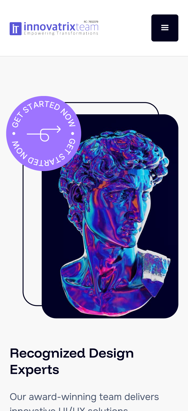
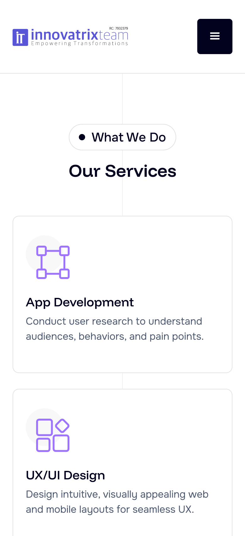
Seven key mobile screens - exported directly from Figma so the type, spacing, and imagery stay sharp.

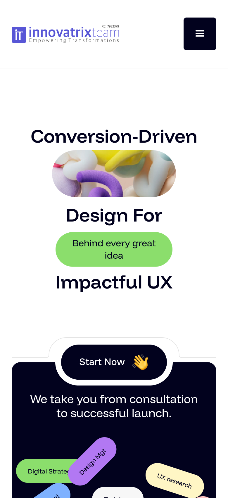
01 · Home hero
Mobile home hero
02 · Recognized experts
Mobile experts section
03 · Services
Mobile services section
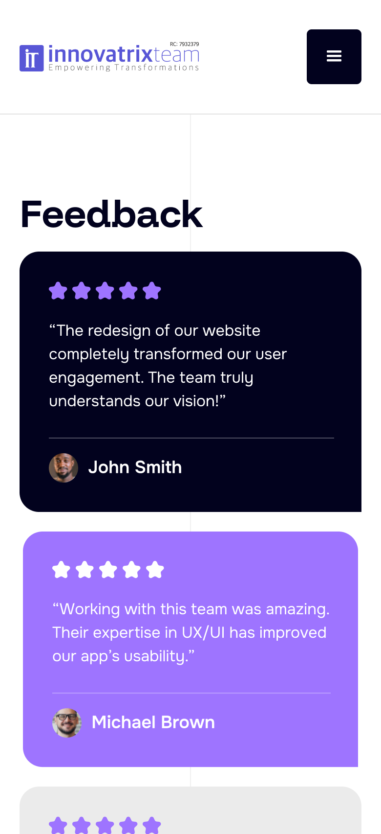
04 · Feedback
Mobile feedback section
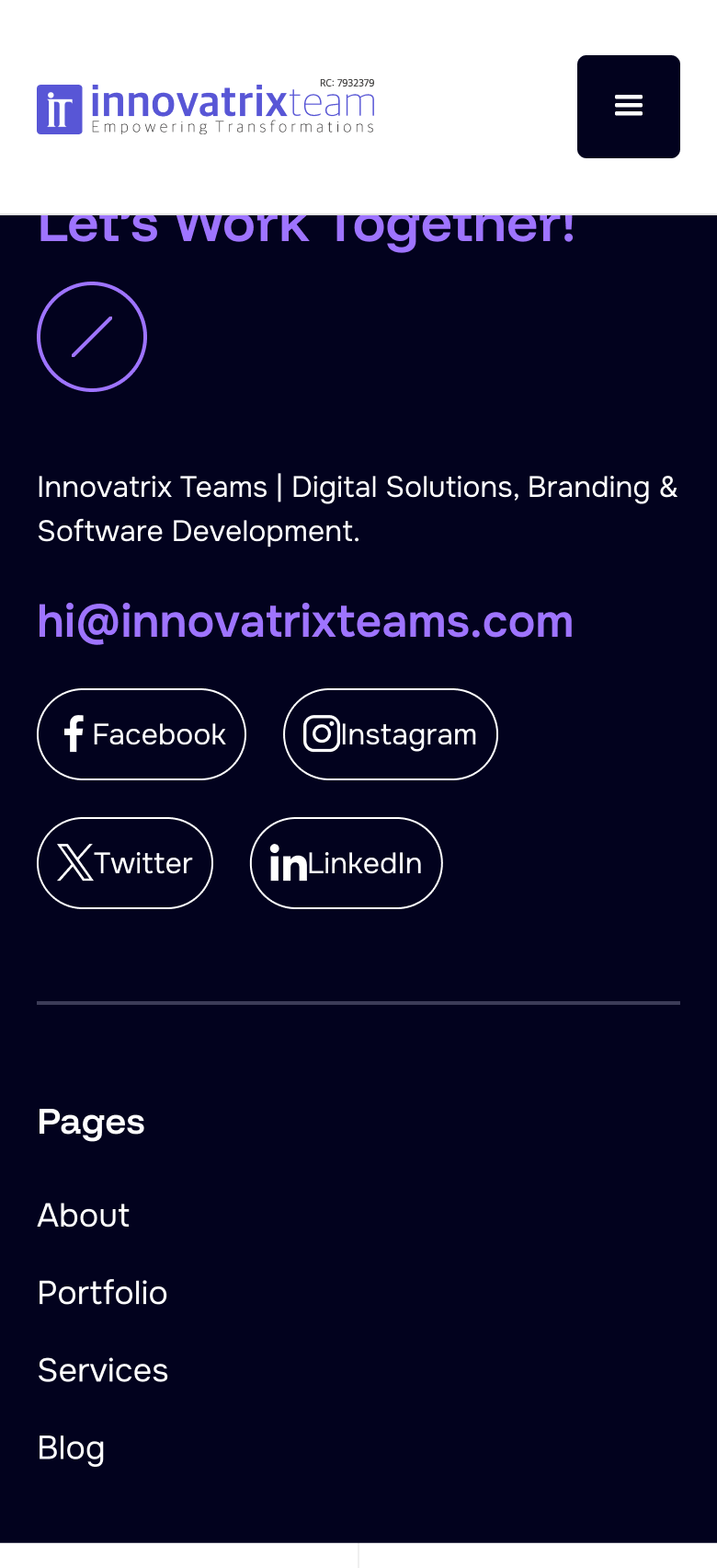
05 · Contact CTA
Mobile footer CTA section
06 · About hero
Mobile about hero
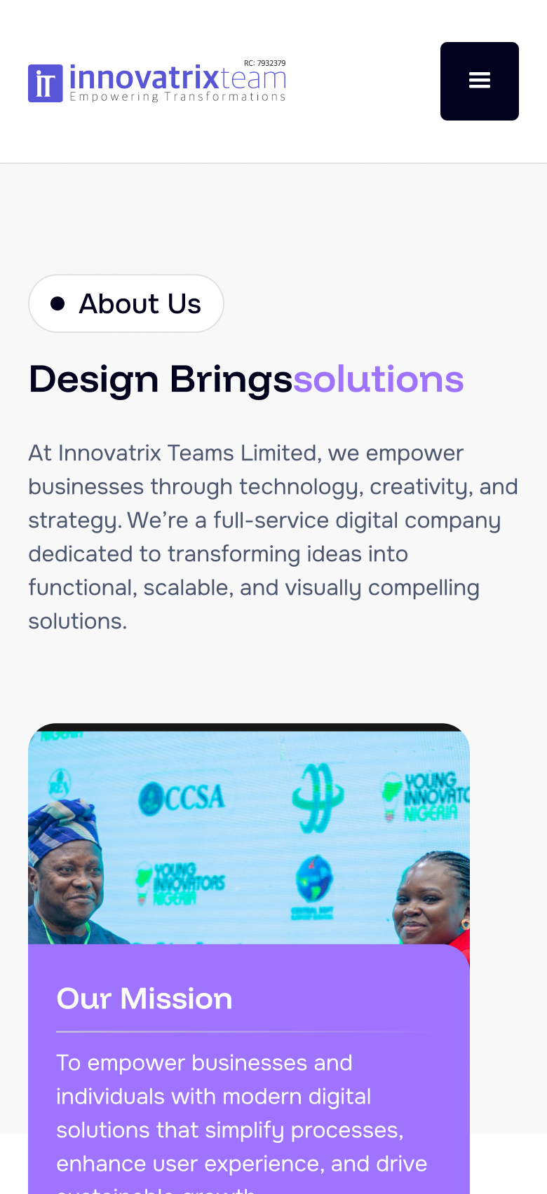
07 · About mission
Mobile about mission section

Display

Funnel Display

Headlines, heroes, and section titles

Medium

AaBbCcDdEeFfGgHhIiJjKkLlMmNnOoPpQqRrSsTtUuVvWwXxYyZz

SemiBold

AaBbCcDdEeFfGgHhIiJjKkLlMmNnOoPpQqRrSsTtUuVvWwXxYyZz

Bold

AaBbCcDdEeFfGgHhIiJjKkLlMmNnOoPpQqRrSsTtUuVvWwXxYyZz

18013080644836

Body & UI

Onest

Body copy, labels, navigation, buttons, and UI text

Regular / Medium

The quick brown fox jumps over the lazy dog. 0123456789

SemiBold

Services · Contact · Let's Talk · Send Message

Bold

Clear hierarchy for UI actions and form labels.

Midnight Navy#050517
Soft Ink#181830
Electric Purple#9C6CFC
Soft Lavender#A884FC
Soft Pink#F0C0F0
Neon Lime#C1FF72
Chartreuse#E4FC60
Fresh Mint#84D86C
Sky Blue#A8D8F0
Cloud White#E4E4F0
Pure White#FFFFFF

What we measure since launch

Success isn't a Figma export - it's whether the right people reach out and how cleanly they move through the funnel. Every number below beat its target.

Strong

18 Qualified Contact form submits in the first 6 weeks live

Steady enquiry flow for a brand-new agency site.

On target

34% Home bounce rate in month one

Good - under the 45% target. People stay and explore.

Fast

41s Median time to first primary CTA click

Good - under a minute means the hero and CTA land clearly.

Clear

4.6 / 5 Avg clarity score in post-launch feedback (n=11)

Visitors say the offer and next step are easy to grasp.

Reflection

What I learned

  • Prospects skim ruthlessly. In tests, people decided “relevant or not” before reading body copy, so Services labels and proof had to be visual, not paragraph-based.
  • Contact friction kills warm intent. Cutting optional fields and keeping email visible beside the form mattered more than another purple accent.
  • Careers users take a different door. Founders never opened job listings; designers went straight to About. One nav had to serve two mental models without clutter.
  • Live metrics close the loop. Building from zero meant launch wasn’t the finish - form submits, bounce rate, and clarity scores showed whether the funnel actually worked.
Thank you for your time.
← Back to top