Goal 01
Lead with the value prop
Replace vague "secure digital payments" copy with a direct, benefit-driven headline users understand in under three seconds.

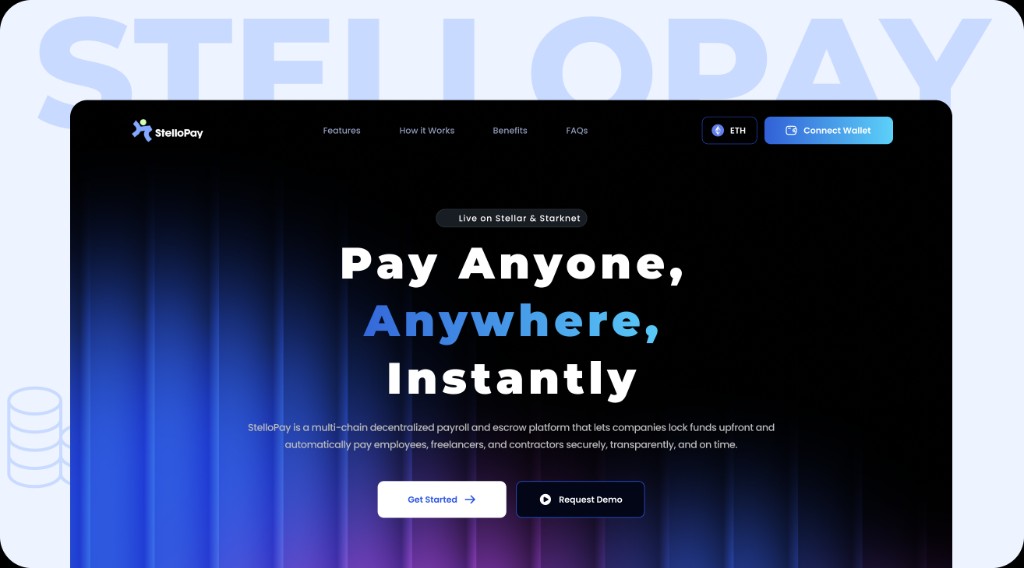
A full landing-page redesign for a decentralized multi-chain payroll and escrow platform on Stellar - turning a fragmented, template-feeling page into a cohesive dark-mode experience built for trust, clarity, and conversion.

01 - Context
StelloPay helps companies lock funds upfront and pay contributors automatically across chains - payroll, escrow, and bulk payouts on one platform. The product was strong; the landing page wasn't telling that story clearly. The value proposition was buried, and the page read like a generic fintech template rather than a Web3-native payroll tool.
"The goal wasn't more features on the page - it was a clearer story: why StelloPay exists, how it's different, and what happens when you click Get Started."
Audited the existing page, mapped user drop-off points, and benchmarked competitor landing pages in Web3 payroll.
Rebuilt information hierarchy - hero, comparison, benefits, process, FAQ, and CTA - before touching visual polish.
Applied a unified dark theme with blue-to-purple gradients, glassmorphism cards, and responsive layouts for desktop and mobile.
02 - Objectives
Inspired by structured case-study storytelling, I defined four goals before opening Figma. Every section had to earn its place on the page.
Goal 01
Replace vague "secure digital payments" copy with a direct, benefit-driven headline users understand in under three seconds.
Goal 02
Add a before/after comparison so visitors see exactly what changes when they switch from legacy payroll tools.
Goal 03
Move from a mixed light/dark layout to one cohesive dark-mode system that feels premium and Web3-native.
Goal 04
Ensure every section - including FAQ, bulk pay, and CTAs - works as a vertical scroll experience on small screens.
03 - Before
The original design used a dark hero with stock card imagery, then abruptly switched to a light "Key features" band with photo cards. The benefits section returned to dark with a triangular card layout - without a consistent thread tying the sections together.

04 - New design

05 - Mobile
Every core section was adapted for a vertical scroll on small screens - from the hero and upgrade comparison through bulk pay, services, and how-it-works - so the story stays clear on mobile.


06 - Prototype
Figma prototype recording - scroll through the full desktop and mobile landing page. Tap play to explore the flow.
06 - Reflection